
I have included various projects that I have worked on using Tableau. The portfolio contains a collection of interactive and
informative visualizations that showcase my skills in data analysis and visualization. Follow the link to access my Tableau Public profile and
explore the visualizations.
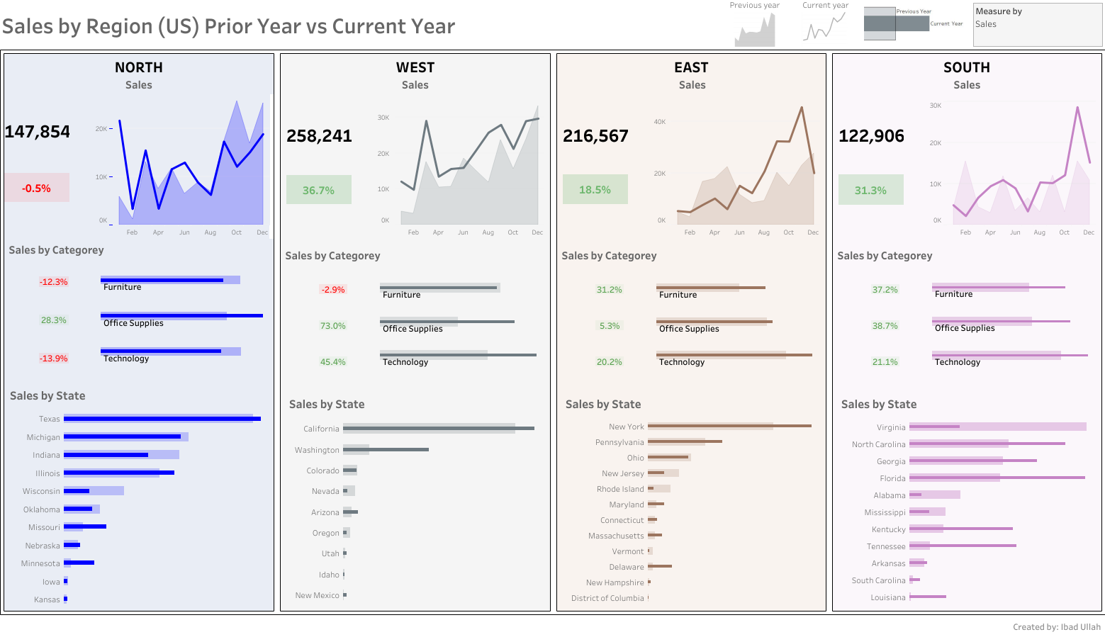
This dashboard provides a quick and easy way to compare sales, profit, and orders between the previous year and the current year. Users can select the parameter they want to compare and view the data by
month, state, and category. The interactive parameter makes it easy to analyze trends and identify areas for improvement in business performance.
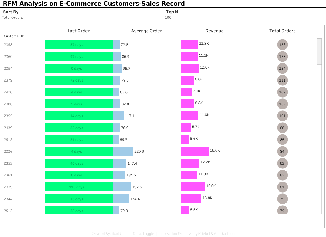
This dashboard presents the results of RFM (Recency, Frequency, and Monetary) analysis, which is a customer segmentation technique used to analyze customer behavior based on their
purchasing history. The dashboard provides insights into customer segments based on their buying patterns, recency of purchases, frequency of
purchases, and monetary value spent.
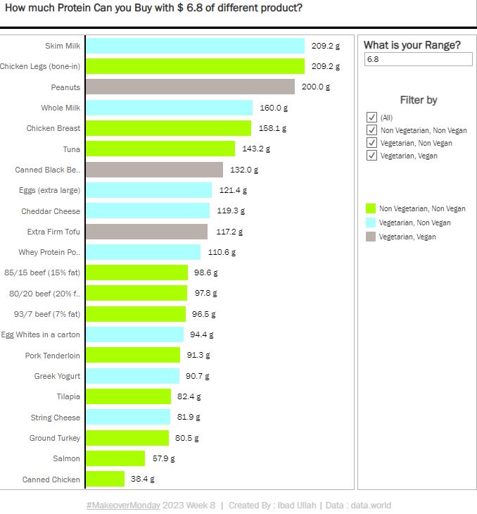
This dashboard allows users to input their budget for protein purchases and see how much protein they can buy with that amount. The dashboard provides
information on the different types of protein available, their prices, and the amount of protein per serving. Users can also compare the prices and
protein content of different brands to help make informed decisions about their purchases.
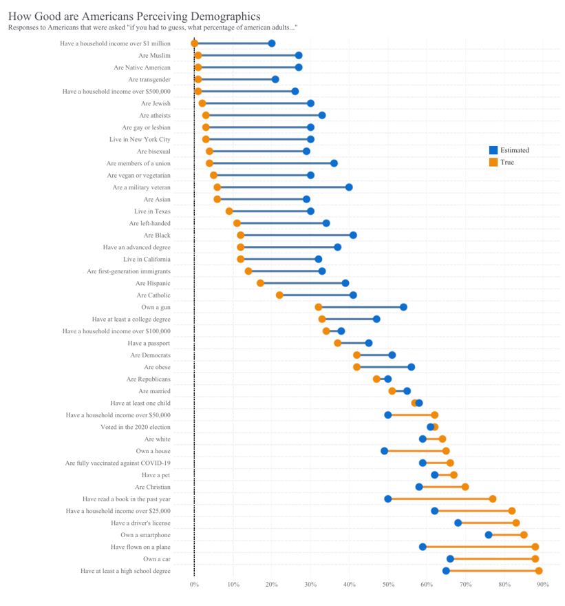
This dashboard presents an analysis of American perception of different demographic groups. The dashboard is designed to highlight the differences in perception
between different demographic groups and to identify any biases or stereotypes that may exist.Overall, the dashboard provides valuable insights into the perceptions
of American society and can be useful for policymakers, researchers, and anyone interested in understanding the nuances of social perceptions.
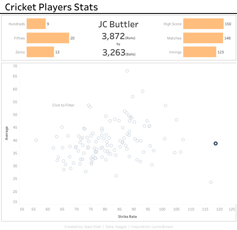
This dashboard presents an interactive scatter plot of cricket players. By clicking on a specific point in the scatter plot, users can view detailed information about the corresponding player, including their name,
team, and other relevant stats. This dashboard is designed to provide cricket enthusiasts with an engaging and informative way to explore player
performance data..